
Tips for Excel, Word, PowerPoint and Other Applications
Bullet Charts in Excel
Why It Matters To You
Bullet charts are a good chart type for measuring metrics against a target. Unfortunately, Excel doesn't support them natively, so you kind of have to hack a standard stacked column chart to make them work. Fortunately, it's not that hard, you just have to work through a couple of things.
Notes
You can only make these charts in Excel. I've experimented around with this in PowerPoint and the only way I can replicate this is to overlay another chart or manually add the target bar. PowerPoint doesn't seem to support adding another series as a different chart type. Also, I drew on articles from ExcelUser and Dashboards By Example to help me to understand this process enough to write a tutorial.
How To ...
This is an advanced charting tutorial. If you're not totally comfortable with charting in Excel, article on basic charting to refresh yourself on the basics of charting in Excel.
You can open the example file, bullet_charts.xls, to see how I've set this up. In the example file, I've set up my control tables, provided an example of the finished completed chart as well as the initial chart output so that you can practice all of the formatting we discuss below.Set Up
First, decide what your performance bands will look like. I'll use a 3-band rating scale using the following:
| Performance Band | Range | Color |
|---|---|---|
| Unacceptable | 0 - 50% | Red |
| Acceptable | 50 - 100% | Yellow |
| Exceeds | 100 - 140% | Green |
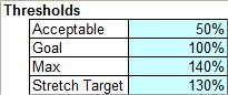
In Excel, you're going to need a table of control values, which will correspond to the three upper limits of each performance band (50%, 100%, and 140%) plus another value for the target (130%). Per my standard conventions, the input cells for this table are shaded in blue to indicate that these are user controlled values.
Next, create the table of chart values. Each chart consists of 3 columns: 2 boundaries and the performance bar. Once we get down the next step or two, it'll become clear why we need the three columns of data.
With the exception of actual performance, all of the chart values are formulas driving off either the control values or the actual performance value. Here's an example of the formula for the Unacceptable bar in the Performance column. The MAX formula simply says that if actual performance is more than the threshold, set the value to 0 otherwise use the difference. Play with the performance values a bit and I think you'll understand what I mean.
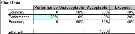
MAX($C$4-SUM($C$12:C12),0)
So, we now have all of our chart values set up. It's time to actual create the chart.
Creating The Basic Chart
Highlight the chart values, click on the Chart Wizard, and then select Stacked Column chart. Click OK.
It should look a little like this. It doesn't look like a bullet chart yet, but hopefully you can see all the essential elements.
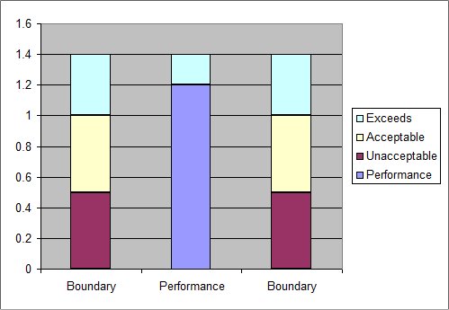
Go to the chart and re-format the data series, axes, and properties according to the instructions below:
- Clear the Legend.
- Format the X-Axis and remove tick marks and labels.
- Format the Data Series: Options: and make the gap width 0.
- Format Plot Area and set the Area color green.
- Format Exceeds Data Series and set the Area color to green and Border color to none.
- Format Acceptable series and set the Area color to yellow and Border color to none.
- Format Unacceptable series and set the Area color to red and Border color to none.
- Format Performance series and set the Area color to grey and Border color to automatic or black.
- Change width of chart as desired.
- Format Y-Axis series, Number Format = Percentage, 0 decimal points, 10 point. You can also set the max value to 140% as desired or to whatever you want.
At this point, it looks pretty close to what we want. To make the chart align perfectly with my cells, I held down ALT while moving the chart and resizing it.
Adding the Target Bar
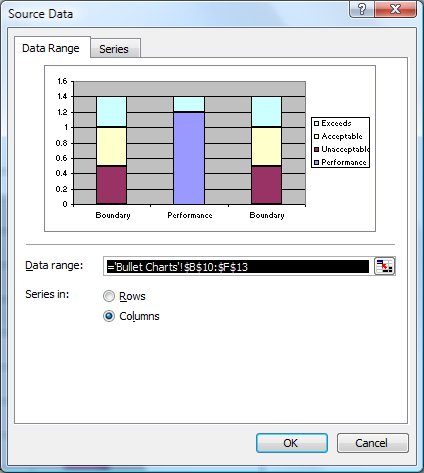
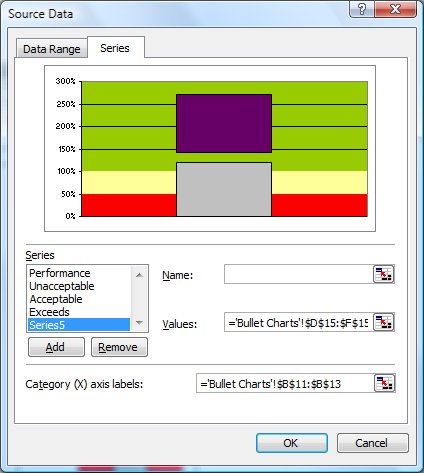
Now we add the target bar. Right click on the chart and select Source Data. Go to the Series tab and click on Add.
- Add the data series from D15:F15. At first, this is going to look very strange, but trust me, we'll fix it.
- Right click the purple bar and go Chart Type, XY (Scatter).
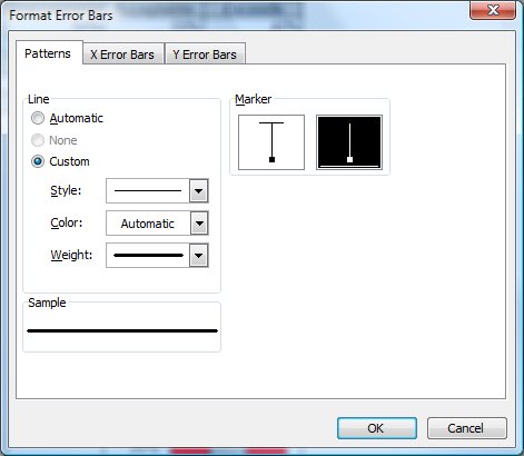
- Select the data point, right click and select Format Data Series.
- Remove the marker.
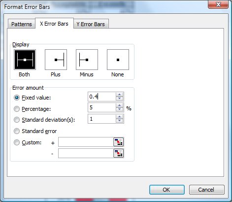
- Go to the X Error Bars tab, select the Both option and set your width to Fixed Value = 0.4. This will set the width of the error bar as a fraction of the width between column 1 and 3. Try setting this to 1 to see what you'd get.
- Right click on the error bar and select Format Error Bars. In the Patterns tab, select the largest line width and a color.
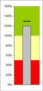
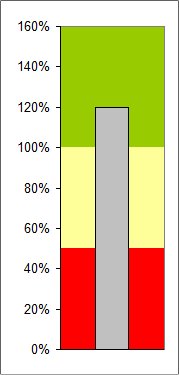
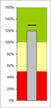
If we did everything right, we should have a nifty chart that looks like this:
This may take some practice to get right, I know it did for me, but once you figure out all of the mechanics, the chart goes together quit easily and using the Camera or Paste Picture Link tools, discussed in another article, you can set up some very nice dashboards.
Notes
| Last updated | 6/23/08 |
| Application Version | Excel 2003 |
| Author | Michael Kan |
| Pre-requisites |
Overview of Excel's Drawing Toolbar Fill Colors in the Office Suite |
| Related Tips |
Cameras, Copy Picture, Paste Picture Link and more really cool stuff |