
Tips for Excel, Word, PowerPoint and Other Applications
Introduction to Charting In Excel
Why It Matters To You
Understanding how to develop charts is a vital skill in making any analysis presentation ready. However, making your point effectively depends not only on having appropriate data, but choosing the right type of chart, the right formatting, and the right delivery mechanism. To be perfectly honest, I wasn't planning on writing an article on Charting in Excel, but on second thought, it needs to be covered and setting a foundation will help better explain Charting in PowerPoint and the creation of custom charts like waterfalls. Better yet, if you learn how to chart in both or learn how to share information between Excel and PowerPoint, then you have the best of both worlds.
How To ...
Prior to developing a chart you should ask yourself the following questions:
- What information do I need to show?
- What conclusions do I want to draw from the data?
- What is the message I want to impart to the audience?.
There are 14 categories of Standard Charts available in Excel, each with their own use. If you understand how the charting engine works, you can mimic custom chart types, such as waterfalls and build ups. There are also add-ins available for Excel that allow for expanded charting functionality, but I have not covered those in this site.
| Chart Type | Description of Use |
|---|---|
| Column Charts | This chart has vertical bars and plots points over a period of time. They are effective when displaying amounts over time. |
| Bar Charts | This chart has horizontal bars and plots points over a period of time. Similar to column charts, they are effective when displaying amounts over time. |
| Line Charts | The line chart is excellent for displaying a trend over time with multiple data sets. |
| Pie Charts | When you want to show percentage relationships in either 2D or 3D, pie charts are most effective. You can select one wedge and drag it from the entire pie to call out one segment. |
| Doughnut Charts | This can be used if you want to plot multiple pie charts against each other. |
| Scatter Charts | If you have data from uneven time periods. This can be used to plot data points against an industry average. |
| Area Charts | Similar to line charts, they are useful in plotting data over time. The visual may be more effective as the area is filled with these charts. |
| Radar Charts | A radar chart will help to visualize the relationship between different set of data such as consumer spending and product focus. |
| Surface Charts | These charts are useful in measuring two changing variables of a topographical map. |
| Bubble Charts | Bubble charts are helpful in measuring three set of values. The first two act as the axes while the third effects the size of the bubble. |
| Stock Charts | These charts are designed to convey stock market information such as, high low close, open high low close, volume high low close, and volume open high low close. |
| Cylinder, Cone and Pyramid Charts | These three types of charts are based on the column chart with an adaptation on the shape. They can be effective when they are used in combination to show differentiation between items in the chart. |
The chart wizard creates graphs that portray selected data. The challenge is to select the chart type that best highlights the conclusions of the your analysis.
There are four (4) basic steps to developing a chart:
- Selecting the type of chart to be used
- Identifying the data to be used in the chart
- Formatting the chart
- Selecting where the chart is to be placed in the file
How About A Little Bit Of Overview First?
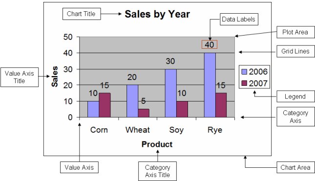
Here's an example chart output. The settings are default, so I haven't toyed around with the formatting. However, it's useful to review the terminology around the various pieces, just so we are all on the same sheet of music.
Generating The Basic Chart
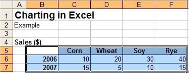
You're going to start off with a data set. You can use the example file, charting.xls, which contains a sample data table and completed charts.
Hopefully it's well organized without too many blank lines or rows. These will affect your chart output. If you have column and row headers, Excel will use these as Category Axis and Value Axis titles. Select the data set and click on the Chart Wizard from the Toolbar, or use ALT + I, H. Make sure you DO NOT select the table title, in this case, Sales ($).
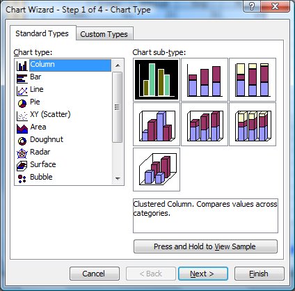
The first step is selecting the type of chart. It will default to Column, but you can click on any Type and see a range of sub-types. If you want a quick preview of what your chart would look like, click on the View Sample button.
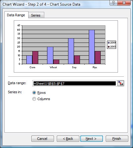
Check the data range and make sure you have the data you want to chart. Click on the example file, charting.xls, to see my original data set and resulting chart. Try selecting the data set including the title, click the Chart Wizard, and see what happens
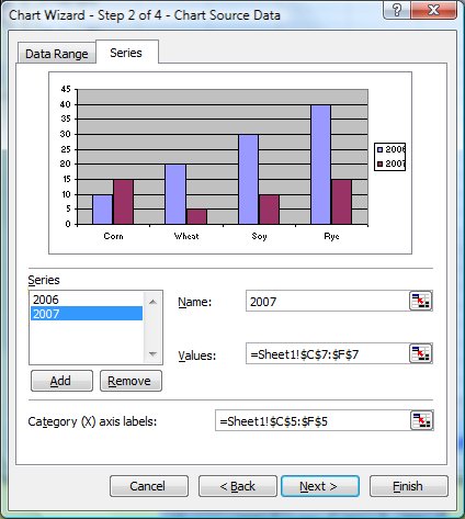
Name the series if you like. This is optional
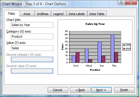
Add chart and axis titles.
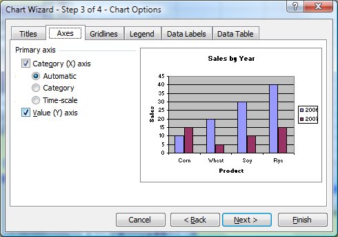
Select the axis settings.
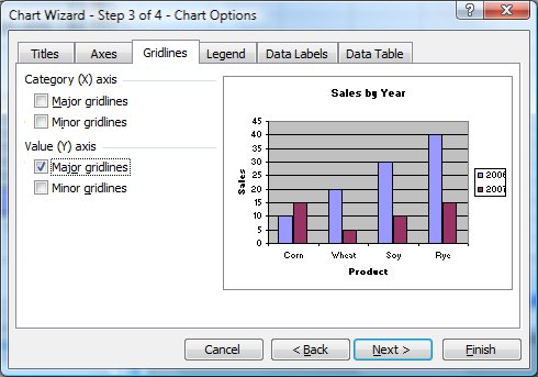
Select the gridlines to use.
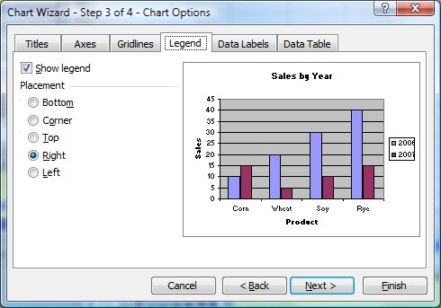
Place the legend.
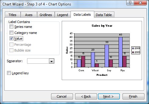
Choose data labels and/or values
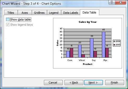
Show the data table if you desire. Alternatively, you can also just position your chart over your underlying data table.
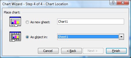
Select where you want to chart to go. You can place it in the same sheet as your data or generate it in a new worksheet.
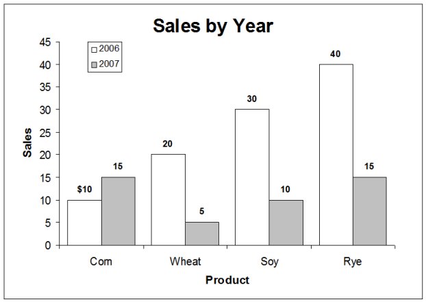
There you go, one ugly chart. In my opinion, the default chart settings in Excel are pretty lame. Personally, I don't make a whole lot of charts in Excel, I tend to use PowerPoint for my charts because the information is typically presented as part of a larger analysis.
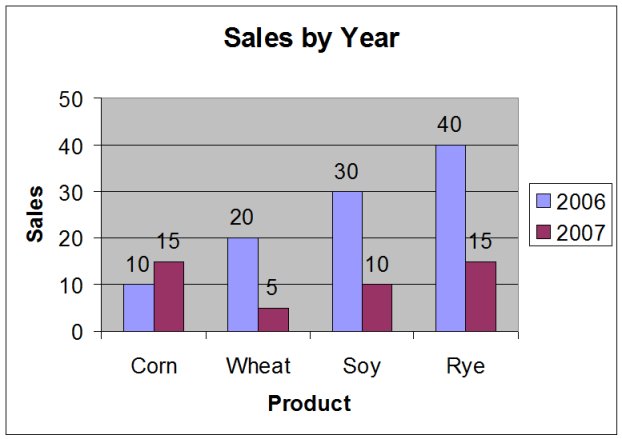
So let's reformat our chart. Flash back to the overview graphic where we covered terminology and parts of a chart. Right click on any chart and you should see options to Clear, if you just want to get rid of something (e.g., gridlines) or Format if you want to change font, font size, color, etc. Everyone will have their own preferences, but by convention, I tend to use the following:
- 10 point, bold for values and category labels
- Eliminate most shading. I'm a bit of a minimalist when it comes to color.
- 50% gap width. When gap width is 100%, especially with single series column charts, the eye plays tricks on you and sometimes it's hard to discern where discrete columns are.
- Currency symbols typically only get added to the first value to eliminate some noise.
- Most of the time I eliminate the scale too. If I have values showing, there is no need to show the scale.
- Remove the borders. I don't really like them. There's already a border around the chart area, I don't need another one around the plot area.
Organizing Your Data
As you can see from the first example, Excel wants its chart information laid out in a pretty specific manner (e.g., row and column headers, no spaces, etc). What if your analysis isn't set up and organized like that? Easy. Just create insert another worksheet titled Chart Data (again, this is my convention), use links to create your table of chart data, and then create your Excel of PowerPoint charts off that. This does a couple of things for you:
- Doesn't force you to shoehorn your analysis to fit your chart. You may need to evaluate 2006 in a separate worksheet from 2007, even though they're summarized together in the chart. This is especially true for chart types, such as waterfalls, which require some manipulation of the data.
- Makes it crystal clear where your chart data is coming from.
- Eliminates the need to re-create your data table every time you need to update a chart.
Notes
| Last updated | 9/8/07 |
| Application Version | Excel 2003 |
| Author | Michael Kan |
| Pre-requisites | None |
| Related Tips |