
Tips for Excel, Word, PowerPoint and Other Applications
Charting in PowerPoint
Why It Matters To You
I probably make more charts in PowerPoint than I do in Excel, mostly because if there's a point to be made, it's better made within the context of a page with source, lead, title, etc, than just in the middle of an Excel workbook ... at least in my opinion?
If you chart in PowerPoint, you're going to have to deal with some disadvantages, namely the inability for PowerPoint to execute calculations, though you can certainly mitigate this by embedding an Excel sheet directly into your slide. However, PowerPoint does give you the advantage of more control around formatting and layout, which should not be underestimated from a communications perspective.
How To ...
First, I highly encourage you to read the Charting in Excel article to get an overview of the charting process. We'll also be using the same sample file, charting.xls to create our chart in PowerPoint. Lastly, example_charts.ppt contains 3 sample charts for you to play around with.
Step 1 - Create a Basic Chart With Your Data
Click on the Insert Chart button in the Standard Toolbar. You should see a placeholder chart and data table open up. This is a marked difference from Excel, at least the exercise we did, where we highlighted our data first, then selected the Chart Wizard.
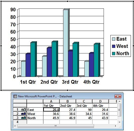
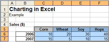
Now open the sample file, highlight the data table, including row and column headers, and paste into the chart data tabe in PowerPoint. Your chart should change to reflect your new data.
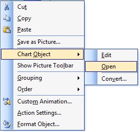
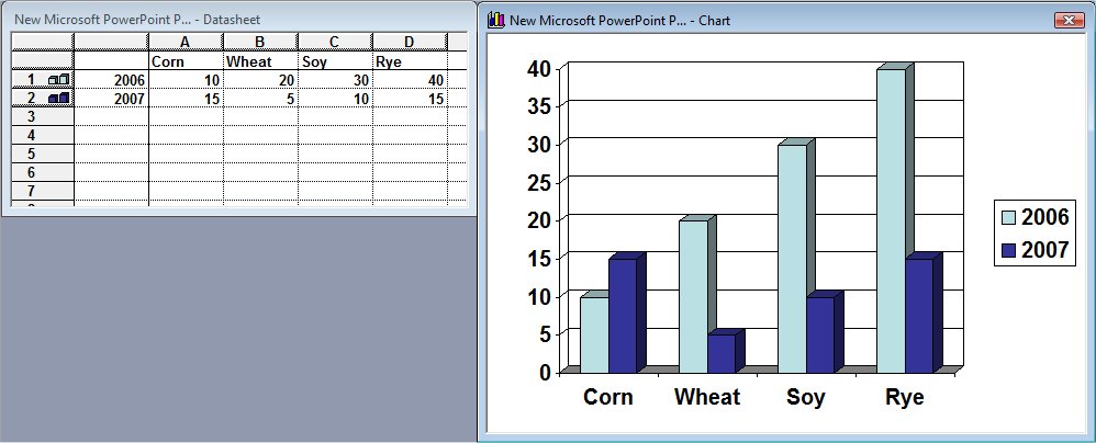
Right-click on the chart and select Chart Object: Open. You should get a second window with your chart and the associated data table.
We're going to start formatting this the way we want it to look. First off, we're going to change the chart type from the current 3-D to a simple clustered column.
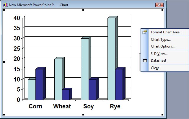
Just like in Excel, you can right-click on any element and select Format **** or Clear. I like my charts to be fairly clean, so I want you to do the following:
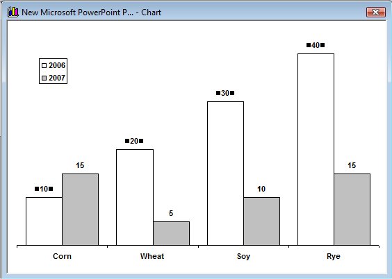
- Right-click value-axis, Clear.
- Right-click gridlines, Clear
- Right-click plot area, select Format Plot Area and select None for border
- Right-click any of the data points, Format Data Series, turn the first series white, the second series gray, and then go to the Options tab and set the Gap Width to 50%
- Go the the Data Labels tab, select Values, then format the values as 10 point. Do this for both data series
- Move the legend to the middle of the plot area and format the font as 10 point. You can also change font sized and font characteristics straight from the Formatting Toolbar too.
- Expand the plot area to fill the area that used to be occupied by the legend
- Format your Category Axis labels 10 point
Based on personal preference, you can also clear the Legend and create one using a table and/or Category-Axis Labels, which you can replace with a simple table. The advantage of doing this would be to have more control over the layout of your chart. Try formatting chart labels when you have very long category names.
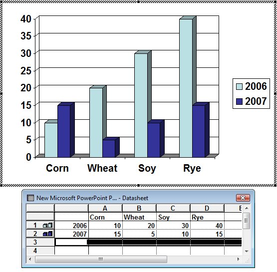
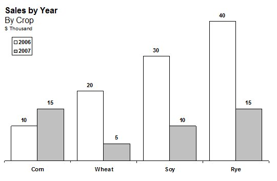
Once you're happy with the look of your chart, close the Microsoft Graph window and return to your PowerPoint page. Add a simple text box with your graph title and your units of measure and you should get something like this.
Again, I should reiterate that this is written for how I like to make graphs look and feel. By all means, experiment around with the various functions and see what they do to your charts. The more you know the better off you'll be.
Organizing Your Data and Working With Excel
As you can see from the first example, PowerPoint likes its chart information laid out in a pretty specific manner (e.g., row and column headers, no spaces, etc). How do you organize your underlying data so that you can copy and paste it easily from your source file, which I'll assume for simplicity is Excel? Easy. I like to insert another worksheet into my workbook titled Chart Data (again, this is my convention), use links to create a table of chart data, laid out as it needs to be for PowerPoint, and then copy and paste into PowerPoint as needed. This does a couple of things for you:
- Doesn't force you to shoehorn your analysis to fit your chart. You may need to evaluate 2006 in a separate worksheet from 2007, even though they're summarized together in the chart.
- Makes it crystal clear where your chart data is coming from.
- Better supports Paste As Link and eliminates the need to re-create your data table every time you need to update a chart. This is especially true if your underlying data changes shape on a regular basis.
But Wait! It Gets Better
If your presentation changes on a regular basis and you control both the underlying Excel and PowerPoint source documents, you can paste your chart data as a link, so that if the underlying data has changed in between the time you last opened the document, your chart will update. Open the charting sample file and a new PowerPoint document. Highlight just the data and the column headers (see example below) and Copy. Make sure you don't select the series titles.
Go to your chart data table and from the Main Menu, go Edit: Paste Special, then click on the Paste Link radio button.
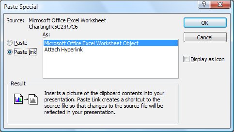
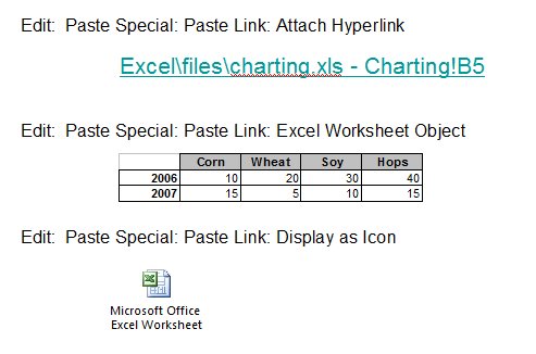
This will dynamically link your chart data to your underlying data source. You'll notice there are other options too: Attach Hyperlink, Display As Icon ... you can even paste in a dynamic data table. For the sake of completion, here's what those options look like:
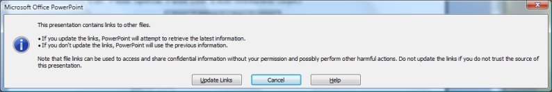
Subsequently, every time you open your Powerpoint document, you may see an update prompt. If you have linked data tables, like the one in the example above, those should be updated the minute you open your PowerPoint document. You will not see changes in a chart however, until you've opened it to expose the data table, then exited out.
Happy charting
Notes
| Last updated | 9/6/07 |
| Application Version | PowerPoint 2003 |
| Author | Michael Kan |
| Pre-requisites | None |
| Related Tips |