
Tips for Excel, Word, PowerPoint and Other Applications
Fill Colors in the Office Suite
Why It Matters To You
Sometimes you just don't want to use the same boring color default color palette for your shapes that comes with the Office Suite of products. There are a ton of options in how to format shapes with color and textures, but you need to understand how drawing items interact to one another to enhance or occlude your message.
How To ...
I'm going to use Excel as my base application for the discussion and examples. While this may seem odd, I'm doing this because the majority of the data in Excel resides on the bottom layer (the actual cells), so any shapes you layer on top of it, will cover up your data if you're not careful. The main body text in a Word document acts the same way. I'm making the assumption that you already know how to use the Drawing Toolbar to create basic shapes. Because I'm using Excel as my example, here's a link to the Excel Drawing Toolbar tutorial.
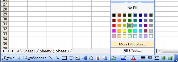
Basic Colors
Create a basic shape and then select it. Now find the paint can icon on your Drawing Toolbar and click it. You will see 40 colors presented as well as the option for More Fill Colors and Fill Effects. Click on More Fill Colors.
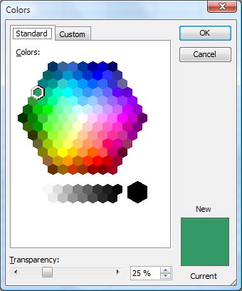
This brings up the Colors wizard. Here, you can select from a much larger palette of colors, click on the Custom Tab to find even more colors, or set the transparency level, which we'll talk about a little further on.
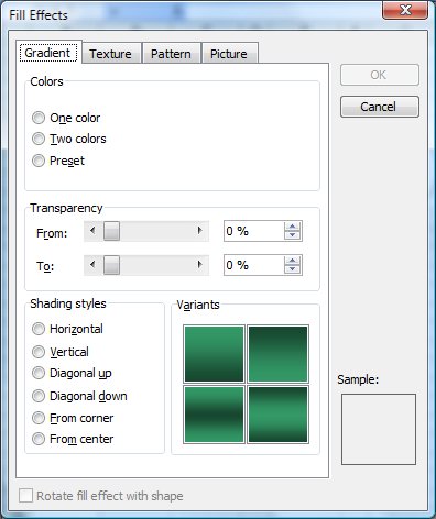
If you click on Fill Effects, it will display the Effects wizard, where you can find color gradients, textures, and patterns. I won't really discuss this, but create a couple of AutoShapes and play around a little bit.
Transparency
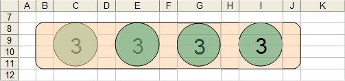
Everyone pretty much understands what we mean by colors, but what is transparency? Here's an example. I've created a simple Excel spreadsheet with the numbers 1 - 5 in it. Over the top of each number, I've added a green circle with different levels of transparency. Remember, in Excel, the data in cells is always the rearmost (also known as the Background Layer), so the only way you can see the data when a drawing object sits on top of it, is if the drawing object is at least partially transparent.
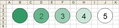
- 100% transparency. Totally opaque and covers up the cell value.
- 75% transparency. Cell value shows through the shape, but is hard to read.
- 50% transparency. Cell value shows through the shape and is easy to read.
- 25% transparency. Cell value shows through the shape and is quite clear.
- 0% transparency. Totally transparent, effectively no fill. Doesn't make sense to give it a color.
That was easy enough, right?
So what happens when we have multiple overlapping shapes and cell values? Let's illustrate that. I've copied example #3 (50% transparency) a number of time and added an orange bar behind it, also at 50% transparency. Maybe you're creating a scorecard or a dashboard and are tying to highlight a couple of key metrics.
The tools we're going to discuss now is ordering how shapes, and therefore their colors, are layered. If you want to reorder a shape, to the the Drawing Toolbar, select Draw, and then Order. You'll see 4 options: Bring to Front, Send to Back, Bring Forward, or Send Backwards. These options do just that. They take the selected drawing item and reorder it in the stack of items.
Here's what my example looks like.
- This shows you how the cell value reads when the green circle is under the orange bar. It's pretty hard to read and the green circle looks pretty ugly. This is layered, top to bottom: orange bar, green circle, data.
- If I move the green circle forward, so that it's on top of the orange bar, the green is certainly clearer, but the text itself really isn't. This is layered: green cirle, orange bar, data.
- I won't explain how I did this in Excel quite yet, but in the third example, I took a picture of the #3 circle and turned it into a dynamic picture object, which I can then layer on top of the orange bar. This also has the effect of making the cell value much more readable. This is more straightforward in PowerPoint, where the text box is simply another element that can be re-ordered just like anything else. This example is layered: green circle, data, orange bar.
- Lastly, I took another picture of just the cell value and layered this on top of the green circle and the orange bar. This makes the cell value the most readable because it's actually on top of everything else and not occluded by anything. Now the layering order is: data, green circle, orange bar.
So there you go, a quick discussion about layering and transparency. I realize this may not click immediately, but practice a bit, maybe in PowerPoint and eventually it'll all make sense.
Notes
| Last updated | 6/3/08 |
| Application Version | Excel 2003, Word 2003, PowerPoint 2003 |
| Author | Michael Kan |
| Pre-requisites | Overview of Excel's Drawing Toolbar |
| Related Tips | Simple Intro to PowerPoint |