
Tips & Tricks for Excel, Word, PowerPoint and Other Applications
Comparative Series Charts in PowerPoint
Why It Matters To You
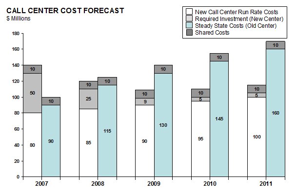
What if you want to compare a time series between 2 different states? A good example would be any evalution of costs between the status quo and a future state where you trade an up front investement for improved efficiency in later years.
PowerPoint doesn't support this chart type out of the box either. I'm sure there are charting add-ins you can find, but you might not have them available at work. However, with a little tweaking, we can get to what we need. By the way, I'm not sure if the name of this chart is correct. If someone has a better name for it, please let me know ... I kind of made it up as I went.
How To ...
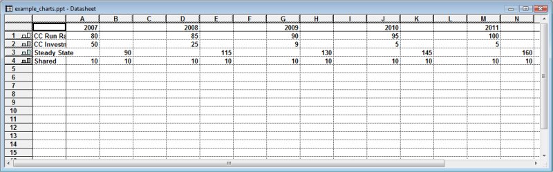
Just like the Waterfall Chart, this starts out as a stacked column charts except that I've changed the gap width to 0%. Null values (column C, F, I, and L) are used to create the illusion of separation between years. I've noted the years in the column headers, but won't actually use them, which I'll explain later. For now, they are there to help me keep track of my data.
Here's what the underlying data table looks like. As you can see, I have a series for each cost component, not all of which apply to each state. You may have to play around with this a bit until you get the general layout you want.
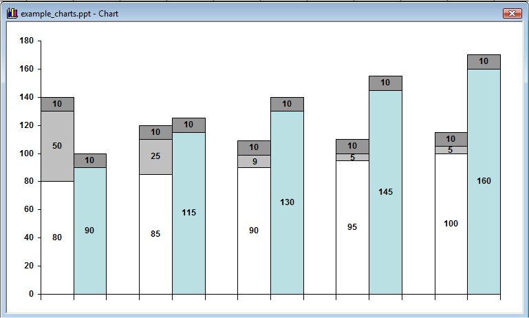
Getting your chart elements to layout properly is the hardest part. Once it looks and feels right, you simply format the values and colors just like you would with any other chart.
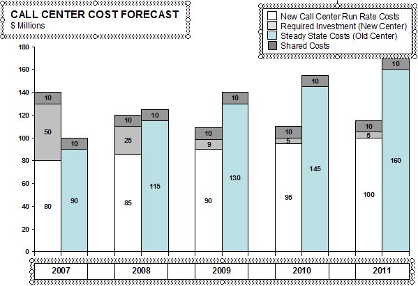
The remaining elements are added in PowerPoint as separate elements. The graphic below shows you the Text Box used for the chart title and units, a table for the Legend and another table for the Series Titles. The selection boxes are shown to help illustrate what is added after the chart was built.
- I used a text box for the title because I have a little more control over size, placement, and content.
- Chart legends can look funny, especially when the titles are long. I separate table gives you more control over size, placement, and formatting.
- I have to use a table for the series titles because each series is actually made of two data points and PowerPoint can't recognize that they have a shared title. Like the legend, series titles in PowerPoint can behave funny if they are long. The table gives me more control. This is a simple table with cells merged for each year and then the borders are just turn off.
Notes
| Last updated | 9/7/07 |
| Application Version | PowerPoint 2003 |
| Author | Michael Kan |
| Pre-requisites | None |
| Related Tips |