
Tips & Tricks for Excel, Word, PowerPoint and Other Applications
Creating Waterfall Charts in PowerPoint
Why It Matters To You
I use Build Up and Build Down (aka Waterfall) charts more than any other type of chart. They are great for showing how components build up to a total (Build Up) or to show the progression from a larger number to a smaller number (Build Down).
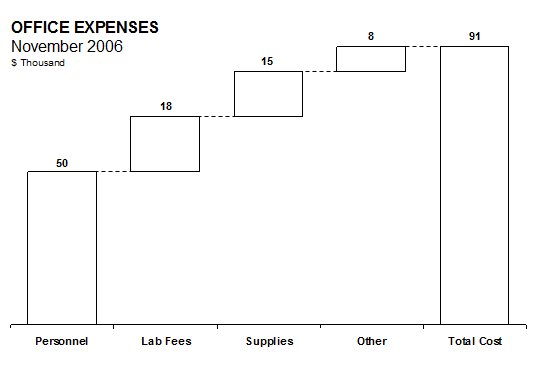
Here's an example of office costs for the month, showing contribution by type to the total. An example of the latter is showing the process of how the evalution started with 40 vendors and settled on the final 5 suppliers. The bad news is that PowerPoint, at least without add ins, doesn't suppor this chart type. The good news is that a Waterfall chart is essentially a Stacked Column chart with some tweaks.
If you chart in PowerPoint, you're going to have to deal with some disadvantages, namely the inability for PowerPoint to execute calculations, though you can certainly mitigate this by embedding an Excel sheet directly into your slide. However, PowerPoint does give you the advantage of more control around formatting and layout, which should not be underestimated from a communications perspective.
How To ...
The first step is actually realizing that Waterfalls are actually stacked column charts with the bottom-most column made to be invisible.
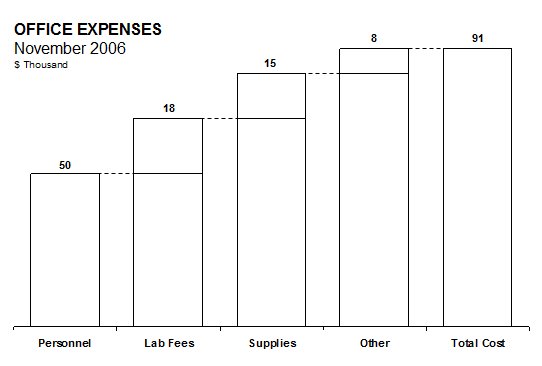
Here's the same chart with the bottom series made visible again, which just meant turning the border on. If you stripped away the connector lines, you'd really only have a very simple Stacked Column chart, where the value of lower data series happens to equal the cumulative values of the upper series to its left. OK, we got over that hurdle. Now, onto the easy part.
An easy way of building (and managing) waterfalls for your presentations is to build them in Excel first (see Charting in Excel). You can create a table of chart data, which can then be cut and pasted into your PowerPoint chart to make an instant waterfall. There are many advantages to doing this:
- You can preview your charts prior to building in PowerPoint
- If the data changes, your charts automatically update
- You can build scenarios into the chart data to model high and low savings scenarios
- Ensures higher degree of accuracy in your chart data
- Can build calculations to build your chart values
Making The Waterfall Chart
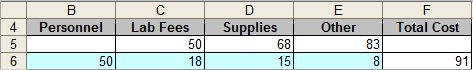
I'm using a data table from charting.xls, which looks like this. By convention, my input cells are shaded blue, everything else is a calculation. The blue cells are what will be shown, the values in the first row will be hidden.
Following the process from Charting in Powerpoint, click on the Insert Chart button and paste the data table above. You will see a default chart that looks like this:
It may not look like our beloved Waterfall yet, but you can probably see where the elements are. Now, let's clean up our chart by doing the following:
- Right-click on the legend and select clear
- Right-click on the vertical axis and select clear
- Right-click on the gridlines and select clear
- Right-click on the plot area and select Format Plot Area. For border and area choose none
- Right-click on the horizontal axis and select Format Category Axis. In Major Tick Mark Type, select none
- Right-click on the blue (bottom-most) data series and select Format Data Series. In the Patterns tab, choose none for Border and white for Area and then go to the Options tab and set the gap width to 50. I set the fill to white so that it will blend into my background. I've found that if I turn the fill off, then I sometimes have trouble selecting the data set at a later time.
- Right-click on the other data series and go to Patterns tab and set the Fill to white.
- Set the font size of your labels and values to 10-point and move the values to the top of each bar.
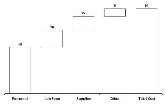
Hopefully, your chart looks something like this ... or pretty close.
Finishing Off The Waterfall Chart
Now we finish it off by drawing a dashed line to connect each segment, add a title and notes, and we're done. Since these lines are separate graphical elements, you will have to manually update their placement if you update your underlying chart data and it results in a change in shape or size.
Notes
| Last updated | 9/6/07 |
| Application Version | PowerPoint 2003 |
| Author | Michael Kan |
| Pre-requisites | None |
| Related Tips |