
Tips & Tricks for Excel, Word, PowerPoint and Other Applications
Anatomy of a PowerPoint Page
Why It Matters To You
Imagine taking any PowerPoint presentation you wrote, extracting one page, and faxing it to someone. Would it stand on its own? Would your recipient "get" the point you were trying to communicate or would they have to guess at your intended message? Most the following discussion is directed at PowerPoint documents used for smaller conference room presentations. Large format presentations are a slightly different animal.
While your intention may be delivery in full color, using snazzy animations, on the projector, to an audience that we can interact with ... the truth of the matter is, once you e-mail a document, you've lost control of it. You cannot guarantee how people are going to print your file, you cannot control which pages people are going to focus on and in what order, and you cannot control how people forward your presentation or even which pages they choose to forward. Simply put, if your pages don't tell the story on their own, you cannot guarantee people will make the same conclusions you intended, and that is dangerous.
Discussion
First off, every organization has its own template. If you don't, then you need to figure out what works best for you. What I'll talk about here is the format I've more or less adopted for myself after working for several consulting firms. I've also adapted it to the default layout at my current employer.
Every page, regardless of layout, should have at a minimum, the following essential elements:
Essential Elements
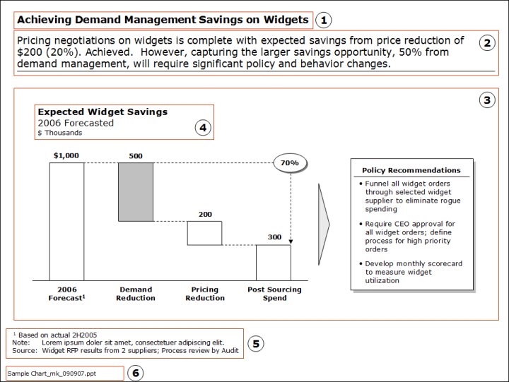
- Titles. Titles help tie your story together. They should be short and crisp. I used 18-point majors and 14-point minors to differentiate between major sections and subsections, just like you would subdivide a bulleted list. As a check, have someone read through your titles and see if they can paraphrase what your presentation is about.
- Leads. Just like titles, leads need to be short, crisp and punchy. Some people won't even bother looking at the content of a slide; they'll just read the lead and move on. If you didn't make your point their, you missed your opportunity. As a guideline, try not to exceed 2 lines of text, 3 at the most.
- Content Area. This one is a little harder because it really depends on what you have to say. However, your data, charts, whatever, need to support your lead. If you audience needs more information, they can go to the content. Aesthetically, your content should be centered vertically and horizontally. The reader's eye should naturally follow the flow of the content in a logical sequence. I use arrows and connector lines to help tie pieces of the story together.
- Chart Titles. Remember that your audience won't have the same degree of familiarity with the numbers that you do. This must be absolutely clear in your chart title or is will lead to mistaken conclusions. The Chart Title should clearly indicate what the chart is. Subtitles are used to provide further context or clarification (e.g., 2006 YTD, Western Region, etc). Units should eliminate any guessing. This should be done in conjunction with the units displayed in a chart. If you're showing profitability, you don't want your audience to be guessing whether 59.8 is $ Millions, $ Thousand, or Percent. Each interpretation leads to a very different reaction.
- Notes. Footnotes and especially sources need to appear on every page. "Facts" get challenged all the time and it's vital that you're clear up front, what your data sources are.
- Document ID. The concepts of the 10-day test apply to PowerPoint documents too - can someone find it and would it be the latest version? How many times has someone handed you a printout of a PowerPoint page and asked for the original file or asked you to include the content in another document? Wouldn't it be nice if you actually knew where to look? By convention, I name all of my files with a short description, a date stamp, my initials, and sometimes a version number.
Formatting, Transitions, and Animations
I'm a minimalist when it comes to colors and fancy transitions, but this is also the result of the way I've traditionally used PowerPoint documents, which involves documents distributed via e-mail. While useful, if not applied thoughtfully, poor formatting can detract from the message rather than emphasize it.
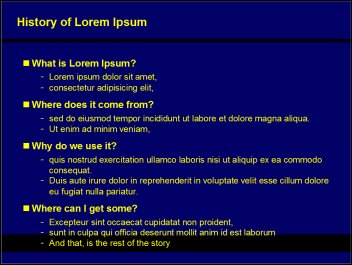
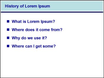
Formatting. Formatting helps set and define document structure. Changes in formatting call attention to the change, but too many deviations from "the standard" result in confusion. Take the following two charts for example. In the left-hand example, it's very clear which savings component is the subject of the slide. What's the subject of the right-hand example?
Likewise, text-size implies some degree of relative importance and topical hierarchy. If you selectively increase font size, you call attention to the text and the message you're trying to make. If font sizes are inconsistent throughout the document, then your audience will be trying to figure out what, if any, significance there is to changes in formatting. This of course needs to be balanced with the overall content on the page. If you have a page that only contains a couple of bullet points, you may choose to increase font size to better frame the content.
Animations and Transitions. Again, I'm not a fan of transitions. True, they can be useful -- when you control the delivery -- but they can also be annoying if someone needs to print a document or view it on their own. Again, avoid relying on your animations and transitions to make a point because once you've distributed your PowerPoint file, you lose control of how people read it.
One of the most distracting things to me, are presentations where every slide transition is different. I find it distracting at best and annoying at worst, especially if really cheesy transitions were selected. It's even more disappointing when the material presented was sub par. It makes me think that the presenter spent too much time on making things "pretty and fun" and not enough time on the actual message. If you're going to use transitions, find a standard and stick to it.
If you're using element transitions to emphasize a series of points (e.g., bulleted items), then you might want to spend a little bit of time working on the layout of your page. Remember, when I print the document, I don't benefit from all of the clever transitions you added to the page. A reader's eye should navigate a page in logical, natural fashion. Most natural for me is left to right and in a clockwise direction. Again, figure out what works for you and stick to it. You can train your audiences to read pages in a certain fashion -- if you maintain some consistency, but if you keep changing things up, your reader always has to guess what they should look at next.
Slides for Large Format Presentations
Oddly enough, I just came back from a conference where I got to see a number of large audience presentations and took some notes about what worked and what didn't. The focus of a large audience presentation should be on the speaker and not necessarily the slides. Slides provide good support, but if the slides are the main message, then people stop focusing on the speaker and start reading slides.
Here are two example slides. If you were sitting in the audience, which would better keep the attention on the speaker?
- Simple transitions work, though I'm still not a fan of super fancy transitions nor a different transition between each slide.
- On the other hand, element transitions, within a page do work. This allows the presenter to talk about each topic before uncovering the next bullet and moving on. Showing everything in advance practically begs the audience to read ahead.
- One picture is worth a thousand words. If you can't come up with a picture, then boil your points into something a short, concise, punch summary.
- Use colors that are easy on the eyes. Super harsh contrasts make it hard to read, especially if the audience has been sitting through a number of presentations.
- Have someone control the slide progression for you or use a remote. It breaks your rhythm if you have to stop and manually forward to the next slide.
- If your slides are being projected on large screens behind you, make sure there is a laptop or a monitor on the floor in front of you so that you can see what slide everyone else is looking at.
- Don't use borders/banners on your slides and if you do, then make sure your text doesn't overlap over.
- Mind the lighting and the use of dark backgrounds. Depending on how the light falls on the screen, your dark background may wash out and make it difficult to read the light colored text.
- Avoid TEXT HEAVY slides. It's really hard to read
Common Mistakes
- Cramming too much into one slide. It's better to split a complex concept across several slides than it is to cram everything into one. The major downside of the "cram everything into one slide" approach is that if your audience doesn't get point #1, the rest of your points fall like dominos.
- Not making a point. This is almost the opposite of point #1. Sometimes we have pages that are fillers, that don't really add anything. You should always be asking yourself, "Do I really need this?" and if not, pitch it or move it to the appendix if it's good support material.
- Forgetting to storyboard. The storyboard is like the outline you scribble on a napkin. Take out a piece of white paper, draw 12 squares on it, and write out the high level flow of your document. This helps ensure that your message is consistent and flows logically. Forgetting about this step can result in hours of wasted work as people develop pages that don't fit or won't get used. This is especially valuable when you have a team of people working on a presentation. The storyboard can be used to get leadership buy in on the overall flow and you can use it to show people exactly what they need to work on and explain how their pages fit into the overall whole.
- Using poorly written leads. The lead is like the topic sentence of a paragraph. Unfortunately, a lot of people start off with the page content (charts, tables, etc.) then write the lead to fit. It should be the other way around. Storyboard your document, write all of the leads, and THEN develop the supporting material and data.
Notes
| Last updated | 9/17/07 |
| Application Version | PowerPoint 2003 |
| Author | Michael Kan |
| Pre-requisites | None |
| Related Tips | None |