
Tips for Excel, Word, PowerPoint and Other Applications
Formatting Org Charts in PowerPoint
Why It Matters To You
Org charts in PowerPoint are not the most user-friendly thing in the world. In fact, they can be downright frustrating. I know it took me a long time to figure out how to change the formatting to something other than the standard rounded grey boxes. Here are a couple of things that might help you make org charts a little more to your liking. By the way, I found several answers to my questions on the Microsoft Office Discussion Groups site.
How To ...
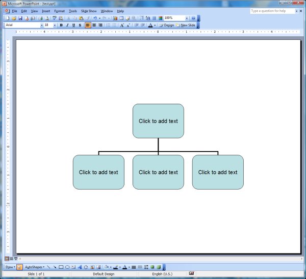
By default, when you first create an org chart, PowerPoint will give you this silly layout. Rounded boxes in a light blue-green.
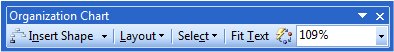
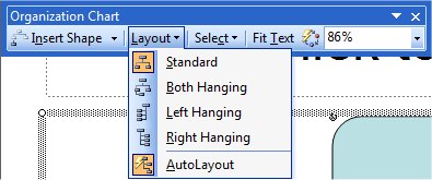
Before you can customize your org chart, you need to familiarize yourself with the Organization Chart toolbar. It should automatically pop up whenever you're working on an org chart, though it may be floating around the middle of your screen. The two items we'll be looking at are the AutoFormat button (the one with the lightning bolt on it) and the Layout dropdown.
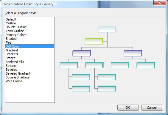
If you click the AutoFormat button, you'll be presented with a number of pre-set formats you can use. Click on one and you will see a preview to the right. I've show the 3-D Color style as an example. Click OK to select a style.
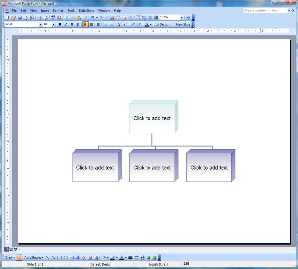
Here's what my org chart looks like with the 3-D style applied.
Unfortunately, the only style that will let you edit the fill, font, and line colors is the default style, so what do we need to do to enable formatting? Go to the Layout dropdown and click on AutoLayout. By default, it's turned on. Clicking on it turns it off.
Once AutoLayout is turned off, you can select a shape and you'll see a yellow diamond-shaped grab bar. Use this to adjust the curves on the box. You will also find that the fill, line, and font buttons on the drawing toolbar are now active. Lastly, you can grab any element such as a box or a connector line and move them around.

Concluding Thoughts
When you first insert an org chart, it will insert a default chart with 1 leader and 3 subordinates. Note the bounding box around those 4 boxes. Any subsequent co-workers and subordinates you add will cause all of the other boxes to resize so that the chart fits within the bounding box. Also, if you disable AutoLayout and insert a new box, it will get inserted into the middle of your org chart. You might be better off expanding the bounding box to whatever you think you'll need, then inserting all co-workers and subordinates, AND THEN disabling AutoLayout to change fill, line, and font colors.
If you need to change the formatting for multiple boxes, just hold down SHIFT and select the cells you want to format. Once you have multiple cells formatted, then any formatting applied to one will be applied to all selected shapes. So, you can turn rounded boxes into square boxes and change fill, line, or font color all in one shot.
Notes
| Last updated | 7/22/08 |
| Application Version | Excel 2003 |
| Author | Michael Kan |
| Pre-requisites | None |
| Related Tips | None |